Lotta Landelius
Graphic Design
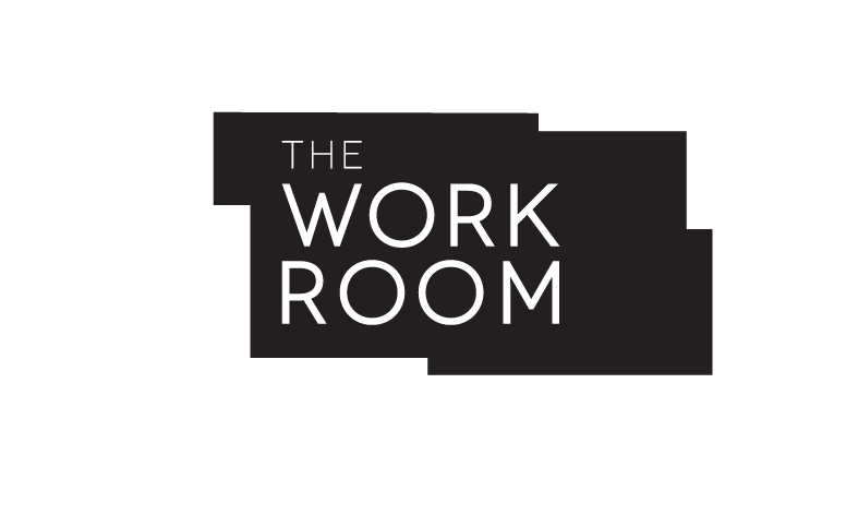
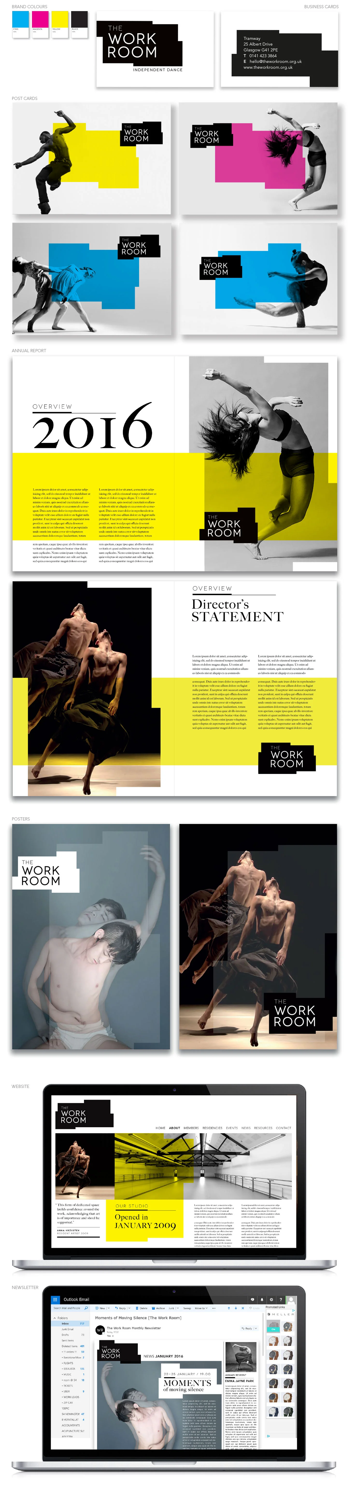
Branding concept for The Work Room, an independent dance organisation in Glasgow.
I focused on ‘The Work Room’ as a space. This is a room, or space, for meetings of independent dancers and minds, for new ideas to develop in the 'in-betweens', for meetings of hearts, bodies and souls.
My concept is based on ‘The Work Room’ being a forever changing space, and that being mirrored in this logo and brand identity. The starting point for the logo being the architectural drawings of the venue, I created six versions of the logo shape. A simple, contemporary and stylish logo, a changing logo for a changing space, which lends itself to a lot of fun, movement and variety in its implementation. This simple shape can be used in a very playful way throughout the identity.
In the spirit of ‘The Work Room’ being a place where anything can happen, a space full of possibilities, I have for the brand colours used CMYK. Cyan, Magenta, Yellow & Black. Them being the base of all print, from which any and every possible new colour can be created. Just as ‘The Work Room’ is a base, a canvas, where any and every possible new creativity and expression can develop.